SCOPE
Motion Graphics Design, Illustration Design, Layout Design, Sound Design
SECTOR
Education
DATE
Q2/2022
MY ROLE
Lead Designer
CLIENT
Noroff - School of technology and digital media
PROJECT TIME
Four weeks
STATUS
Fictitious school project
CHALLENGE
The challenge was mastering a new program in order to creating an engaging motion graphic design sequence. The sound design was also a hurdle I had to overcome.
The Brief
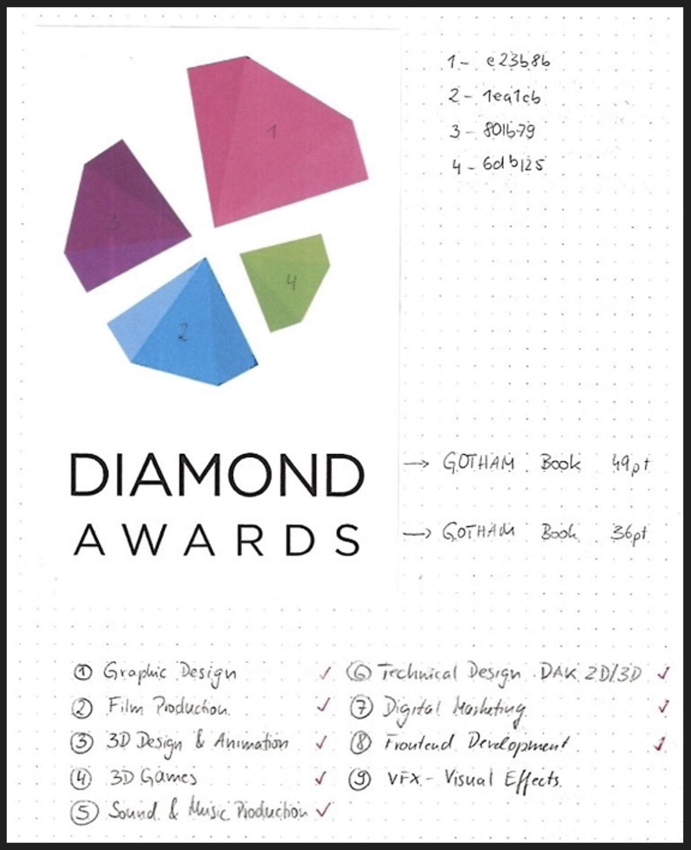
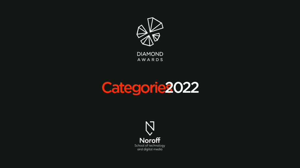
Diamond Awards
Diamond Awards is an annual award show where Noroff students are honored with category nominations and prizes based on the work they have produced during their studies. Diamond Awards needs an animated opening title sequence.
Goal and visions
The title sequence will excitingly present Noroff's courses. It should end with the Diamond Awards logo, preferably animated. The title sequence should also include audio. Be sure to use audio legally by obtaining the necessary rights.
The Diamond Awards categories:
- Graphic Design
- Film Production
- 3D Design and Animation
- 3D Games
- Sound and Music Production
- Technical Design DAK 2D/3D
- Digital Marketing
- Frontend Development
- VFX - Visual Effects
The Design Process
Materializing the Concept
The task was straightforward: Create an animated title sequence with After Effects for the Diamond Awards, an internal trophy ceremony of Noroff aimed at an audience of fellow students and instructors.
In this particular case, I am the target group. This title sequence aims to please fellow students, instructors, and creatives. Teachers want their students to succeed in creating smooth, witty, and creative animations. Diamond Awards visitors are looking to see the up-and-coming generation of creatives and perhaps fish for some talent for their businesses.
I opted for a simplistic typographic concept that resembles the International Typographic Style. The thirty seconds sequence is dynamic, fun, uplifting, and mysterious. You will find more analysis below.
Creative Inspiration
A notebook can get you a long way: I jotted down the brief's major elements in combination with my workflow steps.
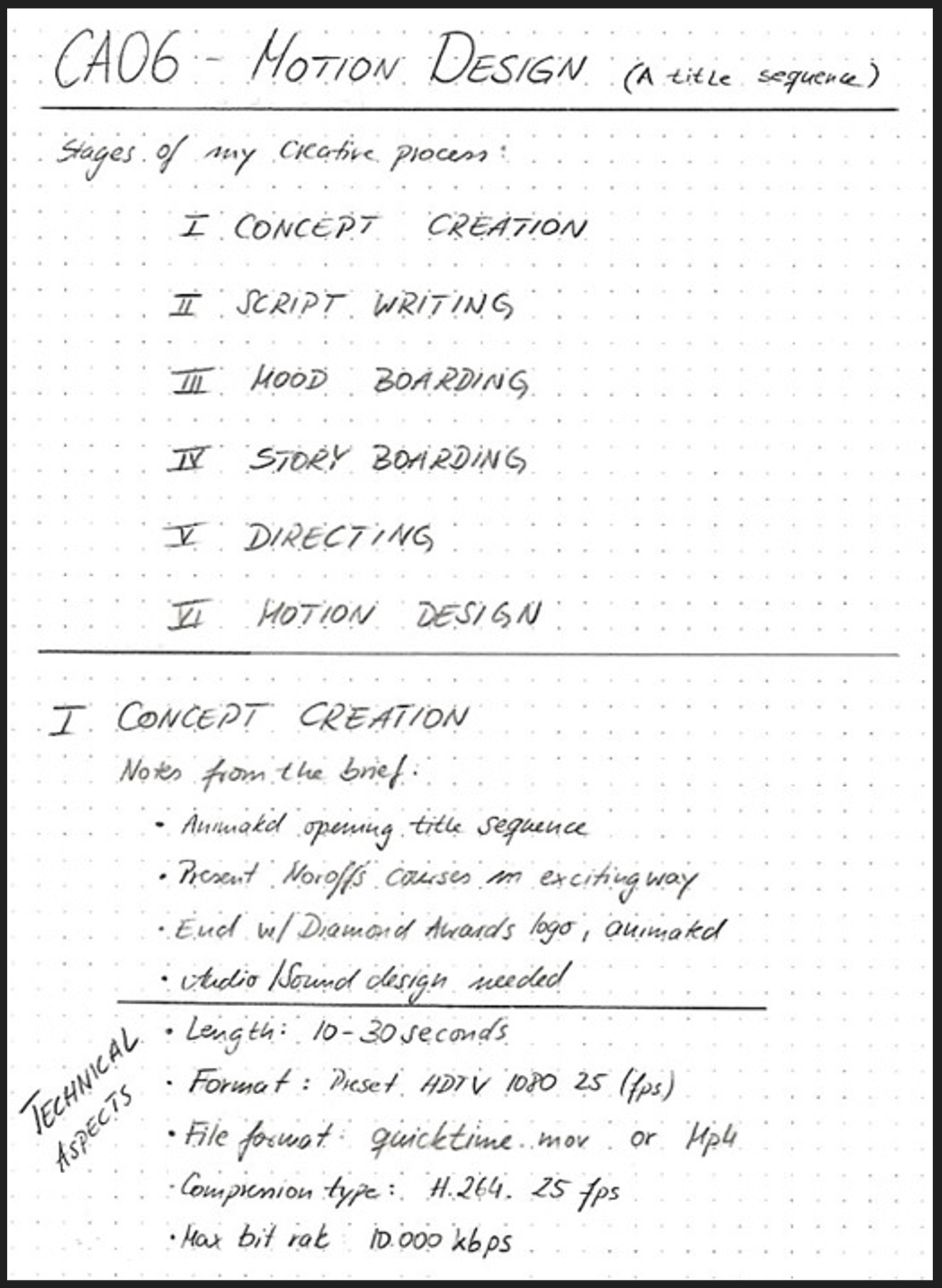
I created a simple game plan in a storyboard to understand how many scenes I would need. I display all storyboards below, where I explain each scene of the sequence.
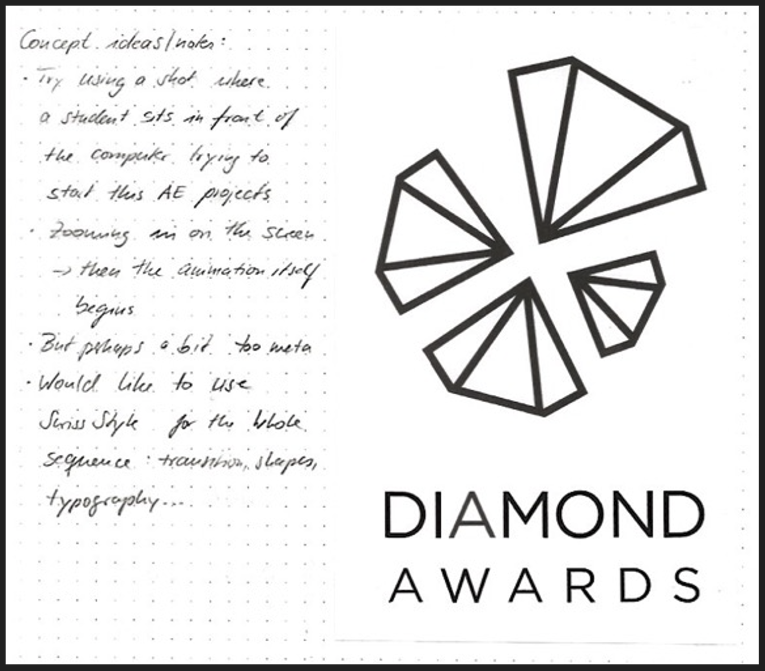
When researching concept ideas, my first idea was to use the Infographic Design from the Design Journey (CA00) assignment. It works well with the target audience and adds my thumbprint to the project. The idea would have been to create an adjusted infographic where all the categories are visible when fully zoomed out. Then the camera would zoom in on each category and wander from category to category with appropriate transitions—sort of like a roadmap.
This concept demanded working with many vector illustrations in After Effects which was not feasible in the given timeframe for the project. I had to find a more straightforward solution.
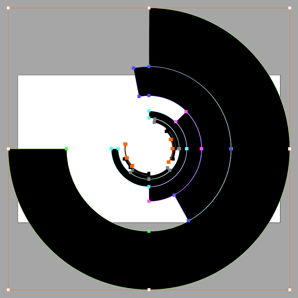
Because the brief asked to present nine categories within thirty seconds, it had to be a typographic concept. I was very fond of the International Typographic Style. I turned to poster designs from this period to seek inspiration. The first that came to mind was Müller-Brockmann's Beethoven poster for the Tonhalle. I vectorized the circle elements to make them dance in After Effects.
When it came to implementing it into the animation, it became complex quickly. However, I held on to the International Typographic concept. Instead of creating mood boards, I looked at posters and book covers from the Swiss Style movement:
The two Müller-Brockmann posters inspired the design of the sequence. I developed the storyboard along with the title sequence. I found more inspiration in some of the student work. My favorite title sequence is this one.
The Final Design
Typography & Colors
I opted for a minimal approach in both color palette and typographic treatment. I used black and white with a touch of Noroff-red to visually accent the sequence. To simplify the color palette, I avoided the multicolor version of the Diamond Awards logo. Then I scaled the visual items across each scene to balance the sequence from frame to frame.
Gotham Medium is the typeface for the sequence. It is the same typeface that the Diamond Awards logo uses. I only changed the font size if necessary. I chose the best font sizes for balance, legibility, and consistency. Lastly, I used the Adobe Font Shelby in the last scene to finish the sequence with a personal touch. It is supposed to give the sequence a hint of "handmade," thus pointing out the hard labor that went into creating the sequence and the Noroff study programs. Red was the color of choice for the Good Luck wishes.
Style, Genre, Composition, Layout, Grid & Self-evaluation
The typographic concept resembles the International Typographic Style. The thirty seconds sequence is dynamic, fun, and uplifting. To keep things simple, I created minimalist icons to support each category visually. I kept to a center-aligned grid and employed only a few scenes with justified left alignment. Let's talk scene by scene:
Scene: Intro
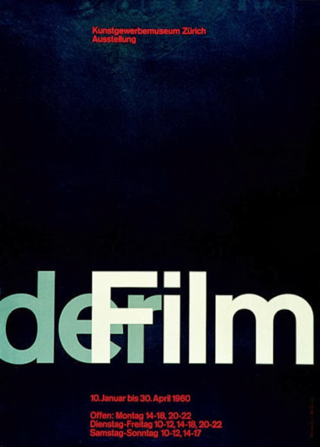
You can see the difference between the original storyboard and my final version in the sequence. The challenge was not to overload the scene with too much visual information because the music drop came after only one second. I introduced the awards sequence with the Diamonds Awards logo and the Noroff logo. One option to improve this short introduction is to make the music clip a bit longer and have the first sound drop two to three seconds into the sequence. However, the argument can be that it keeps things interesting until the end, when the logo returns more prominently. It may work without the logo in the beginning. Müller-Brockmans derFilm poster inspired me for the overlapping type. The scene ends with the curtain opening to reveal the categories.
Scene: Graphic Design
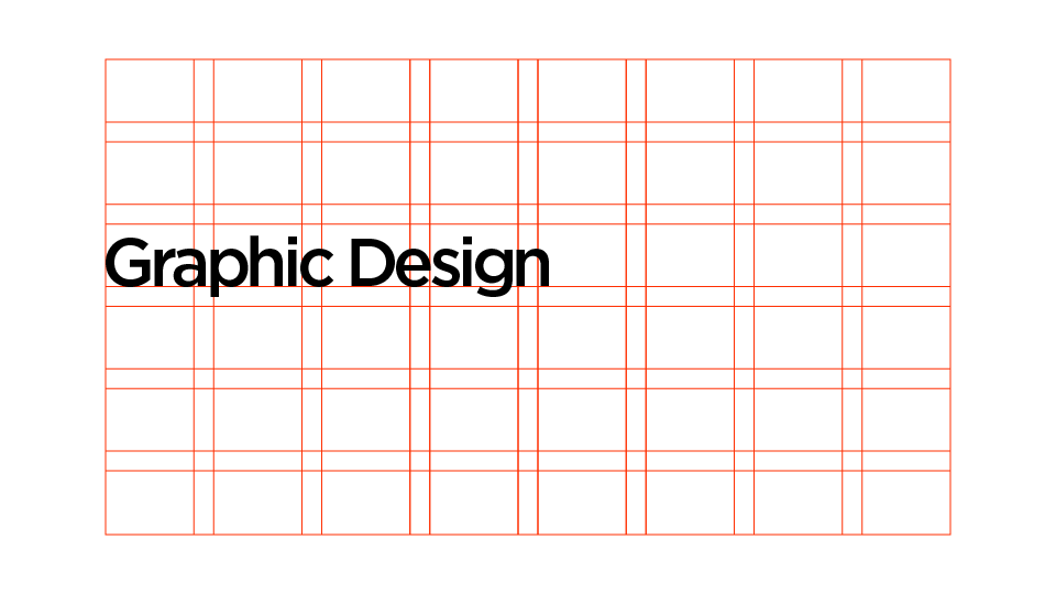
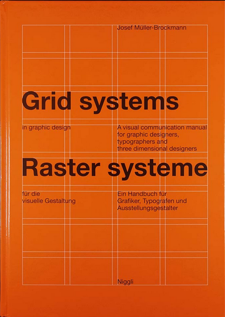
Müller-Brockmann's book Grid systems inspired this scene. I revealed the type upward to find its proper place in the grid. This animation speaks for the Swiss creed that the type must be orderly aligned. I close the scene by opening the top and bottom of the background like a scissor.
Scene: Film Production
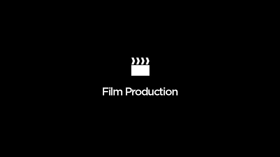
I mirror this scissor movement with the film cut icon I created in Illustrator. Furthermore, I added a white noise effect to the scene to signify white noise on TV. Then I let the icon move out like Pacman and let the title fade.
Scene: 3D Design & Animation
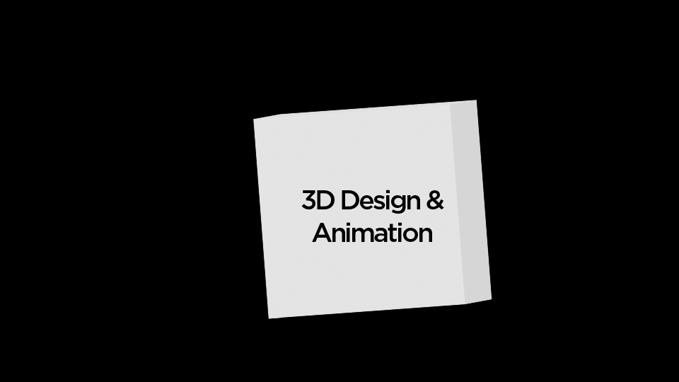
Scene: 3D Games

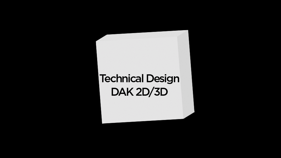
Scene: Technical Design DAK 2D/3D
Scene: Visual Effects VFX scenes
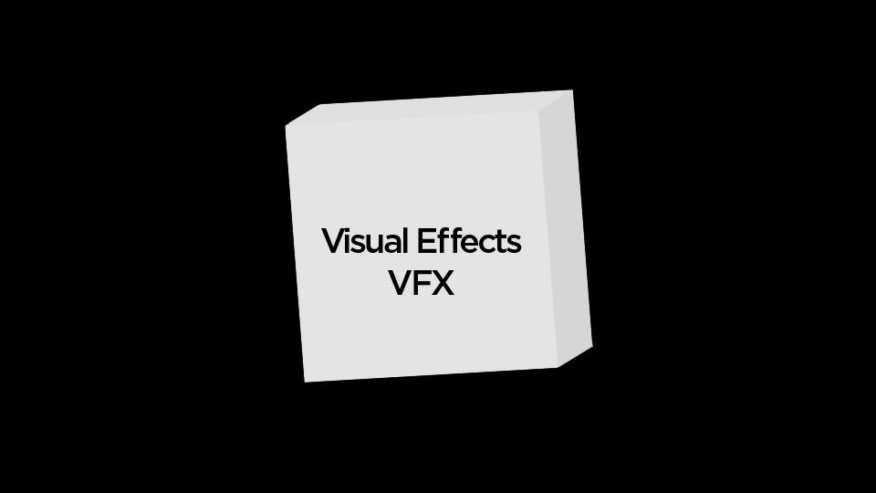
As the film cut icon moves off the screen, the cube element moves onto the screen. Everything that has 3D in its name is part of the cube. I added white and red lights to the scene to provide the cube depth. The cube spins around before it reveals the next stage and moves off-screen again. I gave the Visual Effects the color red because everything seems so fast-paced in the scene. If I had kept the type black, people might not have noticed the change because attention had already shifted elsewhere after reading the previous title. I found this Youtube video inspiring for this sequence scene.
Sound & Music Production
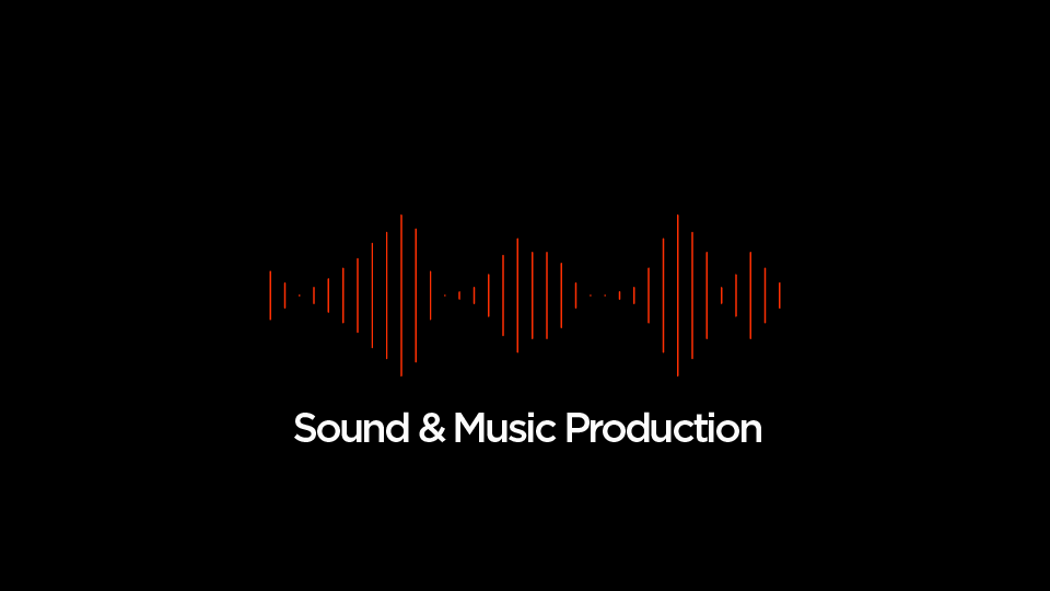
The cube reveals the next scene when moving off-screen. The cliche waveform effect mirrors the soundtrack and speaks for the category. I choose red for the waveform to transition from the previous title and to add some accent.
Digital Marketing
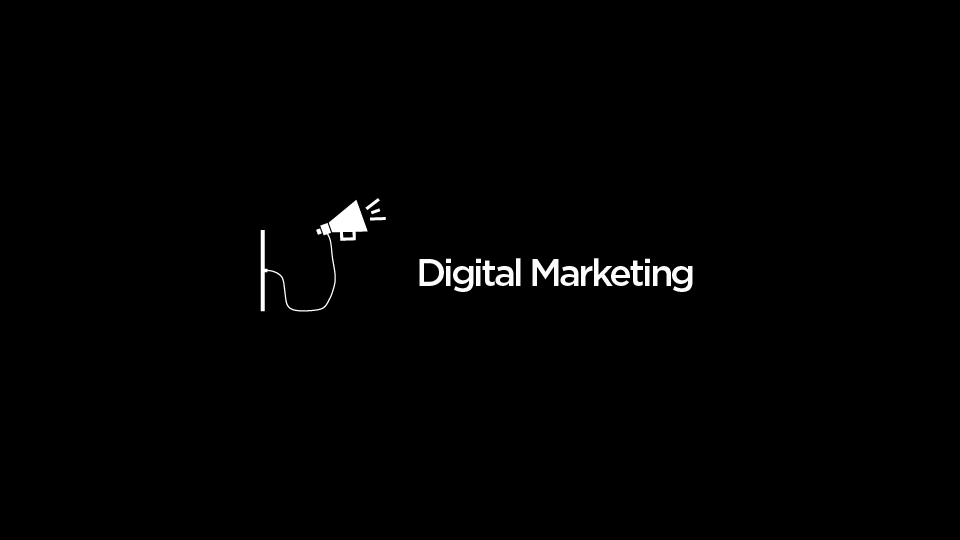
This scene pushes out the waveform and takes over the attention: Typical Marketing move! The dissolve effect of the title is called "digital." I created the icon in Illustrator and animated it in After Effects.
Frontend Development
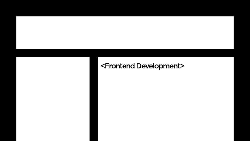
This scene pushes out the waveform and takes over the attention: Typical Marketing move! The dissolve effect of the title is called "digital." I created the icon in Illustrator and animated it in After Effects.
Outro
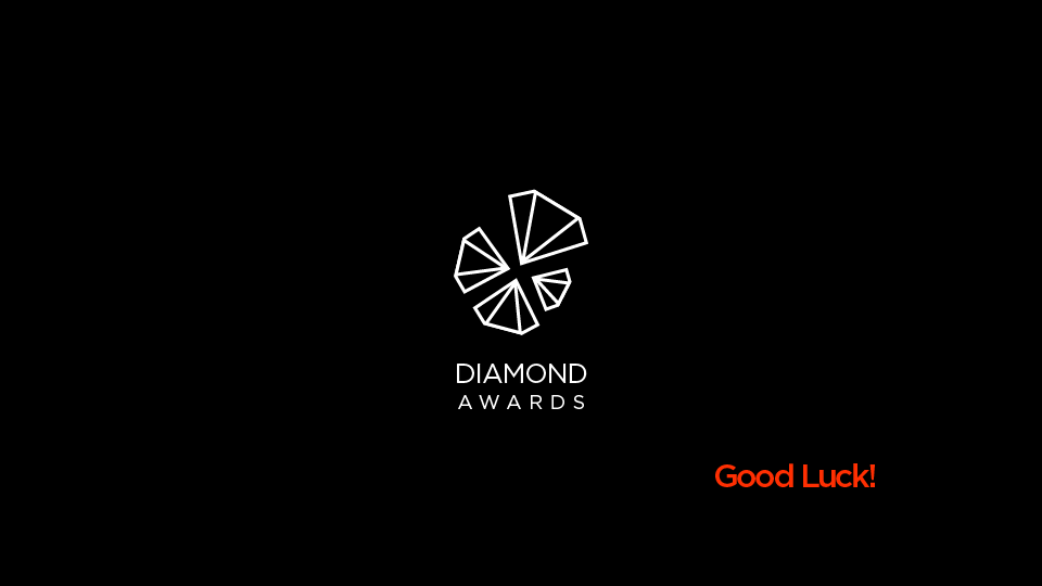
I animated the Diamonds Awards logo into the last scene with the support of the music. Manipulating the scale of the logo, making it appear from the front, and then bouncing back slowly creates a connection to the audience. I strengthened this connection with "Good Luck!" wishes.
Sound Design
I used a song from Adobe: Cinematic Intro 21 / Atmospheric, Mysterious / 117 BPM / 30s. The fast-paced music creates a feeling of hard work before the final drop, which is hitting "Send" on a final project, perfect for a student to relate.